

Designing a Visual Language for Luxury Living in Nature
Overview
Amoda is a luxury gated community of private villas set in the hills of Lonavla, a place designed for residents who want to unwind, reset, and live entirely without friction. Surrounded by over 100 species of flora and fauna, the property offers a rare kind of luxury: one that doesn't compete with nature, but belongs to it. My engagement started as a freelance project with a real estate company building this community. It grew into something much larger; a unified visual language that now spans the physical environment and the digital product experience.
Duration:
March 2019 - July 2019
Role:
I owned the visual language, end-to-end colour, typography, illustration style, the icon system, the way finding application, and the concept and UX direction for the concierge app. This was a solo freelance engagement, with feedback cycles directly with the client's project management team.
Impact:
Delivered a complete visual language system from scratch, including a 15+ icon set built on a consistent botanical grammar, a colour palette drawn directly from the site's landscape, and a wayfinding system applied across the physical property. The visual language was approved for brand-wide extension across all digital collaterals.
The Context
The client was building a luxury gated villa community in Lonavla - surrounded by over 100 species of flora and fauna, and had nothing but a placeholder logo to show for it. No brand direction. No visual language. No defined scope.
What began as an icon design brief grew into something much larger: a unified design system that had to work across multiple touchpoints and multiple years, from a six-foot wayfinding flag to a 44px app icon.
The Problem
Most luxury real estate leans on gold, ivory, and heavy serifs - a visual language that signals prestige but creates distance. Amoda's selling point was the opposite: nature, ease, and belonging.
The brief needed a design language that felt genuinely connected to the land, could extend across physical signage without feeling municipal, and translate into a digital product without losing its identity.

Design Decisions
Colour from context The palette was drawn directly from the environment - teal, sage, muted greens. The colours residents see when they look up from their phones.
Line art for scale and longevity Line art over filled icons: it communicates finesse and restraint, scales from flag to phone screen, and ages without dating.
Botanical accents as identity Every icon is paired with a secondary botanical element - a leaf, a frond, a blossom. The property has over 100 species of flora and fauna. The icons carry that identity without being heavy-handed.
A grammar, not a collection The icon system was built on rules: consistent line weight, botanical accent always secondary, every icon tested at two scales (wayfinding and app UI). New amenities can be added without breaking the system.


The Wayfinding System
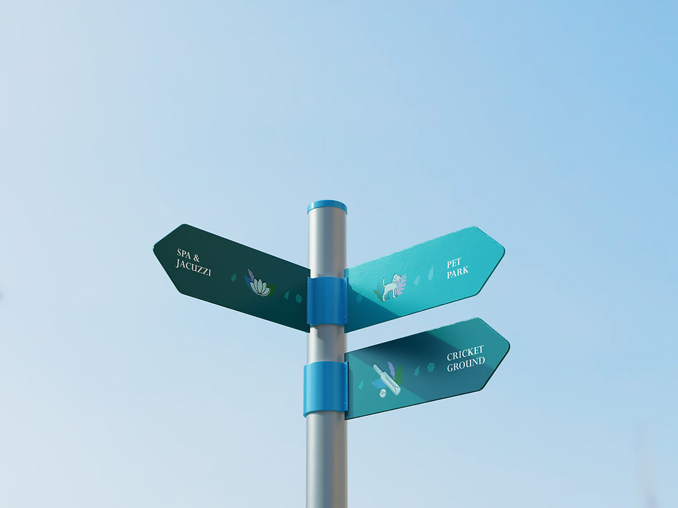
The icon system's first physical test was the property itself; large-format flags positioned at each amenity zone. Luxury Villas, Camping Zone, Family Pool, Badminton Court.
The teal palette, line art icons, and botanical accents translate directly to signage scale. The result is wayfinding that doesn't feel like wayfinding. It feels like the property has a personality.
The Concierge App - Digital Extension of the Visual Language
Discovery - Before designing screens, I ran working sessions with property managers, project heads, and brand leads. The goal: understand what a resident's actual day looked like and where friction would appear without a digital layer.
What emerged was clear - residents didn't want a booking tool. They wanted the property to anticipate them.
Structure - The app was organised around four pillars built from those conversations: Home, Explore, Services, and Activity. The emergency feature sits outside the nav hierarchy entirely - one tap, always.
Wireframes - First, I built lo-fi wireframes before touching the visual system. The booking flow went through the most iterations - collapsing from five separate screens into one scrollable view with a persistent confirm button.
Visual language applied - Once the structure was validated, I translated the brand system into UI components and applied it across screens. The same botanical icon that appears on the Spa flag appears as an amenity tile in the app. That continuity is the point.


Outcome
The visual language was approved and extended across the property - flags, signage, brand materials, and the digital product direction. The icon set became the foundation of the brand identity.
More than the deliverables: a system that works at every level, from physical environment to digital product, without losing coherence.