

Nova Dental Care Branding & Website
Overview
Nova Dental is a family dental clinic conceived for long-term relationships in a category dominated by clinical sameness. The brief was to create a brand that felt trustworthy and calm, without leaning on predictable dental symbolism.
The identity was shaped through abstraction and restraint—drawing from the form of teeth, the idea of shine, and the meaning of Nova as a bright, dependable presence. Rather than announcing itself loudly, the brand was designed to settle in, feel familiar, and be remembered.
The result is a composed, contemporary identity system that works seamlessly across physical and digital touchpoints, supporting trust, recall, and growth from launch onwards.
Role:
Brand Consultant & Visual Identity Designer
Duration:
Nov 2024 - Dec 2024
The brief
Dental brands all say the same thing — clean, safe, professional.
That’s the problem.
The dental clinic category is visually monotonous. Most brands rely on white-and-blue palettes, generic tooth icons, and clinical language. While this establishes baseline credibility, it also creates a sea of sameness where brands are hard to remember and emotionally interchangeable.
Nova Dental was entering this exact landscape.
The brief wasn’t to “look premium” or “look friendly.”
It was to build a brand that could earn trust without blending in.
The challenge:
-
Stand out without gimmicks
-
Feel warm without losing credibility
-
Appeal to families without becoming childish
-
Be remembered beyond the first visit

The approach
Trust isn’t a differentiator in healthcare. It’s the baseline.
Early discovery revealed that no patient chooses a dentist because the brand claims to be trustworthy. That’s assumed.
What actually drives preference is how the experience feels:
-
Calm instead of anxious
-
Reassuring instead of intimidating
-
Confident enough to return — and bring family members
This reframed the role of branding:
Not to prove competence, but to reduce emotional friction.
Rejecting extremes to claim the middle ground
A competitive scan revealed two dominant patterns:
-
Over-clinical brands — sterile, cold, transactional
-
Over-friendly brands — playful, smile-led, often juvenile
Nova Dental didn’t belong at either extreme.
The opportunity lay in the middle:
A composed, human, quietly confident family dental brand.
The idea
Nova — a calm, dependable, constant
Rather than dramatising “newness,” Nova was positioned as something enduring:
-
A steady presence
-
A clinic that families trust over time
-
A brand that doesn’t oversell itself
The goal wasn’t to shout. It was to settle in and stay remembered.


The identity concept
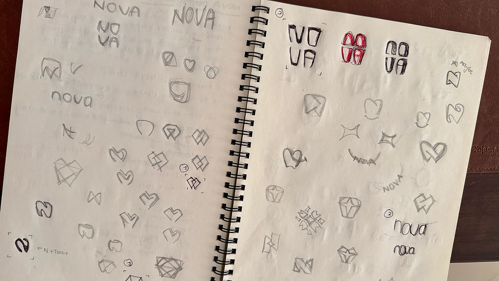
Moving away from symbols. Designing meaning instead.
Instead of defaulting to literal dental imagery, the identity was built through conceptual abstraction.
The core idea combined:
-
The front four teeth — the most recognisable dental cue
-
The idea of shine — hygiene, care, confidence
-
The meaning of Nova — brightness, presence, reliability
These ideas were embedded directly into a custom wordmark, allowing the brand name itself to carry meaning.
The identity doesn’t point to dentistry. It’s constructed from it.


The impact
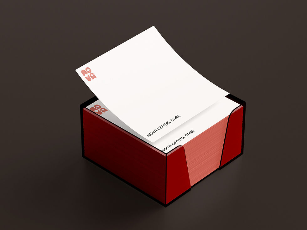
-
Brand colours and visual language received consistent positive feedback in the physical space and printed collaterals
-
Identity became a conversation starter, rather than blending into a typical clinical environment
-
Built a recognisable local presence

